Page 1 of 2
Enormous traffic pane
Posted: Thu Aug 05, 2021 1:39 pm
by semmyroundel
I am beginning to regret buying the XT, but as I will not get close to it's value selling it on, I'll have to come to terms with its shortcomings (as I see them).
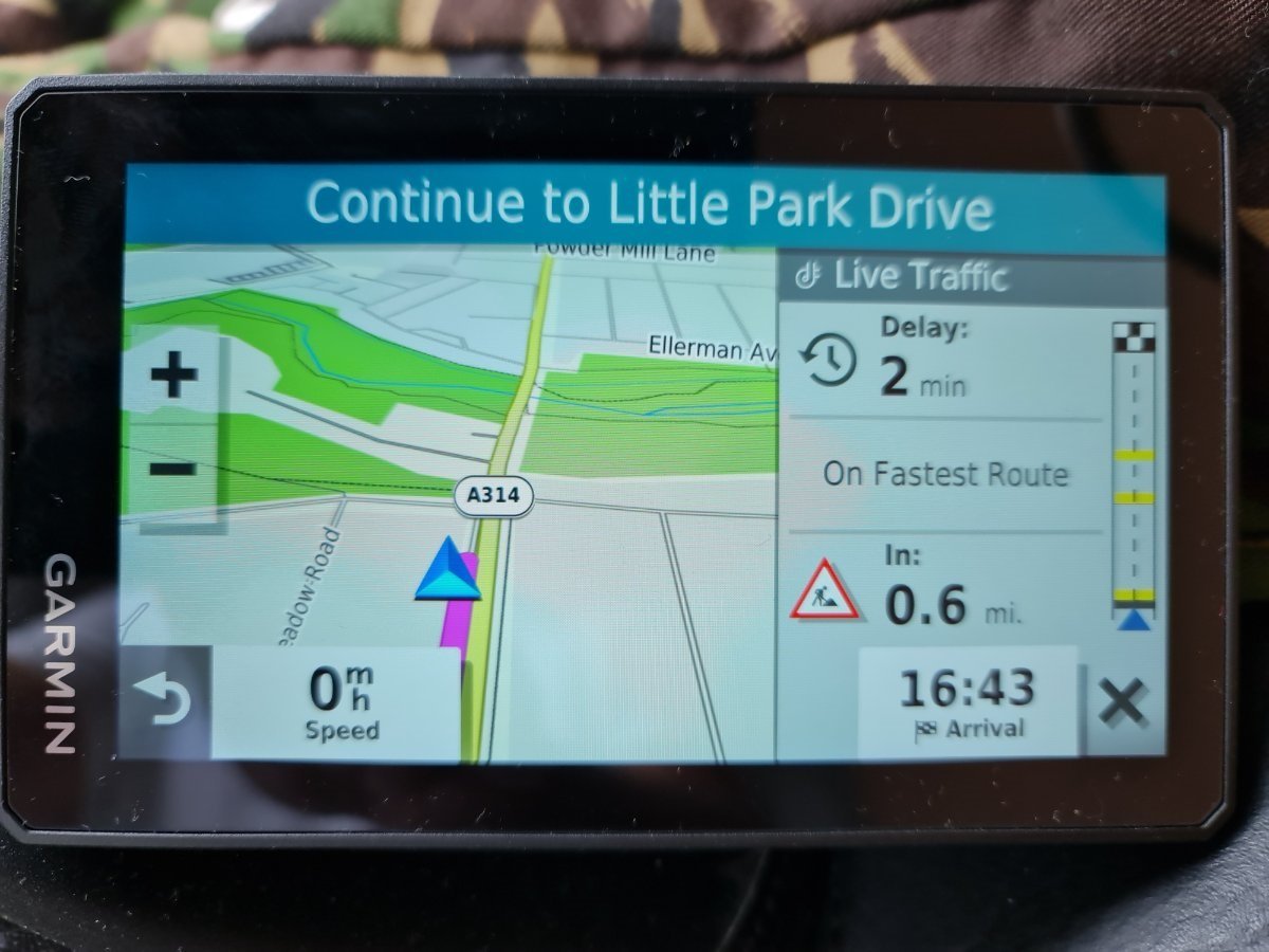
The big problem for me in comparison to my phone's TomTom Go app is the live traffic pane. It takes up nearly half of the screen in whatever mode it's orientated.
Is there any way of making it smaller?
I ask this as I had a situation today where an alternative route became available off the motorway which had traffic up ahead, and because of the reduction of screen size, it was difficult to see where the exit was.
Re: Enormous traffic pane
Posted: Thu Aug 05, 2021 2:01 pm
by V-Tom
Can you get a screen print and post it so we can see the actual size of it?
..Tom
Re: Enormous traffic pane
Posted: Thu Aug 05, 2021 2:48 pm
by semmyroundel

- 20210805_154512.jpg (160.47 KiB) Viewed 3505 times
Re: Enormous traffic pane
Posted: Thu Aug 05, 2021 2:49 pm
by semmyroundel
Sorry, didn't realise it would come out upside down, but you can see what i mean
Re: Enormous traffic pane
Posted: Fri Aug 06, 2021 3:33 am
by V-Tom
I normally run my XT (and all my past GPS units) in North up mode so my screen is a bit different. I think my traffic warning is a bit smaller.
I never felt that it gave me any issues and of course it's very easy to zoom in to see the upcoming turns. (I don't use "Auto zoom" but it might help you out.)
Others might have better ideas.
..Tom
Re: Enormous traffic pane
Posted: Fri Aug 06, 2021 4:23 am
by jfheath
semmyroundel wrote: ↑Thu Aug 05, 2021 1:39 pm
I am beginning to regret buying the XT, but as I will not get close to it's value selling it on, I'll have to come to terms with its shortcomings (as I see them).
I know that feeling very well, but Don't regret it, and don't compare. The Zumos work in different ways from what I have gleaned from other units. Once you start to understand how it behaves and you work with it - foibles, quirks, gotchas and all - it becomes an impressive bit of kit - and it never does anything that is unpredictable.
I haven't noticed a traffic display that large before. But its a warning, that's all. Note the important info and Dismiss it with the X button. The next time there is traffic info, another display will still pop up.
Re: Enormous traffic pane
Posted: Fri Aug 06, 2021 8:51 pm
by fredaroony
I regret buying mine as well for this reason. Tomtom’s screen layout is far better in terms of information.
Garmin waste far too much screen realestate yet provide less information. Why not fill the entire bottom section with tiles of data??
Re: Enormous traffic pane
Posted: Fri Aug 06, 2021 10:09 pm
by semmyroundel
Ok, so I emailed Garmin on this. They said that it was not possible to make the pane smaller, however, I learned that it can be setup not to be there constantly or minimised by pressing the X.
It will still return though, but at least it's not there all the time whilst live traffic is enabled.
I know what jfheath means, but still, if TomTom could do it, why couldn't Garmin?
However, I'm learning how Garmin do things that others don't, so all in all, it does what's needed, shame that it's little quirks can be a bit annoying.
Re: Enormous traffic pane
Posted: Fri Aug 06, 2021 10:14 pm
by fredaroony
Then you miss other information you might want as you're limited to the two boxes at the bottom. Older Zumo units were able to display four at the bottom
Re: Enormous traffic pane
Posted: Fri Aug 06, 2021 10:16 pm
by semmyroundel
fjheath: "and it never does anything that is unpredictable"
I'd have to take issue with that as it continually tried to make me do a U turn today that I knew was totally useless and would make my trip longer, just because I hadn't taken some routing advice (I had local knowledge that was better).
I was totally surprised what route it asked me to do.
But plus points: massive clear and bright screen, variable adventurous routing on the motorbike option, very quick go to data entry (my Tom Tom Go app can often not find destinations).
So good and bad, I'm learning to live with it.
Also: "I haven't noticed a traffic display that large before. But its a warning, that's all. Note the important info and Dismiss it with the X button. The next time there is traffic info, another display will still pop up"
I would've thought that the less we're prodding our screens, and more we're looking at the road, the better. I for one don't want to be cancelling live traffic infos all the time.
To prove what I mean, I'll take a screenshot of TomTomGo app traffic info that is so slight on screen real estate, I never switch it off.